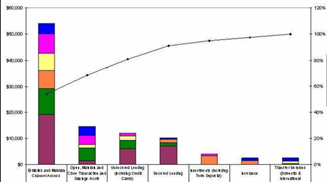
I’ve been asked do do a Chart/Graph that looks like the attachment in Desktop Intelligence, I can’t find the ability to do some of these things.
Can anyone tell me if these things are possible and if so how to do them?
A line as part of a bar graph, the line represents a cumulative running total of the values, I can’t see anty “mixed” chart option allowing me to do this, let alone aclculating a running total and using it.
A sum of the values on the Y Axis on the left, a percentage on the Y Axis on the right.
The X Axis titles labels are very long, I’d like to wrap them to 2 or 3 lines but I can only see the option to pivot them which doesn’t look good either.
BJF: The type of chart you will want to use is called the “vertical bar and line”. In your example you show a vertical bar stack and line, which is not available (and which is a bummer).
To achieve one of your objectives: a line showing accumulation, you can set up a column in your grid using the “runningsum()” function (inside the parenthesis you will stuff the measure you are already totaling on). Once your running sum is established, then you can turn the grid to vertical bar and line chart, thus making some of what you want to work.
Sorry I can’t be of much help with the remaining portions of your requirement.
Start with a datablock containing at least one dimension and two measures (one of which should be your cumulative total variable, using a runningsum formula). Convert to a 2D column chart. Right click on chart, select format chart, select series tab. On the left, select [u]Primary Y-axis[/u] and click on Add (“Group 2” will appear.) Click on the “+” next to Group 1 and drag the cumulative measure, dropping it onto Group 2. Select Group 1 and ensure it is set as a column chart. Select Group 2 and convert it to a line chart.
This is known as a secondary y-axis. Start with a datablock containing at least one dimension and two measures (one of which should be your percentage measure). Convert to a 2D column chart. Right click on chart, select format chart, select series tab. On the left, select [u]Secondary Y-axis[/u] and click on Add (“Group 2” will appear.) Click on the “+” next to Group 1 and drag the percentage measure, dropping it onto Group 2. Select Group 1 and ensure it is set as a column chart. Select Group 2 and convert it to a line chart.
I think you’ll be stuck with this problem. Maybe you could create a variable that shortens the labels. Sorry!
 (BOB member since 2006-04-19)