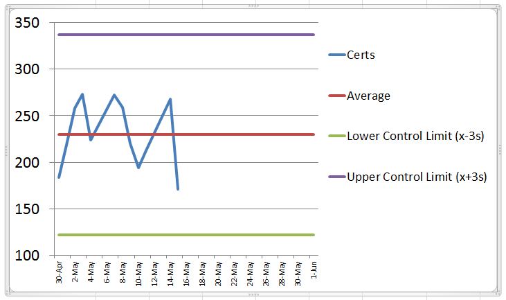
My boss was happy to, for the first time ever, receive a report with chart showing how my department is processing heavy amounts of data on a daily basis. I used a simple line chart to display each day’s numbers. In the Report Footer, I placed the average daily numbers.
Now he is not satisfied. He wants the chart to not only show the daily numbers, but have a line indicating the average for the selected date range plus a Lower Control Limit (x-3s) and an Upper Control Limit (x+3s).
Can anyone direct me how to modify or create such a line chart?
I have attached a screen shot of the chart he created in Excel.
Chamsin ![]() (BOB member since 2008-06-05)
(BOB member since 2008-06-05)