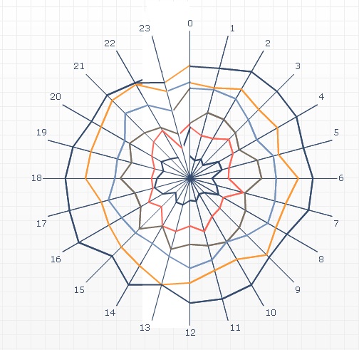
I’m playing with a radar chart. I’ve got 7 series - one for each day of the week, and my data points are the 24 hours of the day, which gives me a nice pictorial view of when calls come in.
On the graph it’s a continuous circle per day, but in reality, midnight Monday connects to 1am Tuesday, so it’s one long line for a week that goes around 7 times if that makes sense.
Is there any way to connect the series up in this way, while still having each series/day in a different colour?
I’ve played with this for a while and really haven’t found any solution I like.
There’s a very complicated hack that might be possible, involving dynamically positioned images to cover the line between 24 and 1, and to add a line between monday-24 and Tuesday-1 and so on, but honestly it would be a mess to implement.
Thanks for looking, gaffika. I had a feeling any solution would be harder than my imagination thinks it is! I just keep looking at the data and thinking I only need to offset each day by an hour and it’s one of those things that seems just out of my brain’s reach.
I like a challenge but maybe it’s a step too far. It would just be so useful and more intuitive for the users to predict future resource demand.
Well basically the problem is that the radar chart only makes circles, whereas you want a spiral. Naively you might think you can just add a 25th hour and make it equal to the next day’s value, but obviously that won’t work.
As a sidenote, have you considered adding an analog clock in the middle of your circle, showing the current time?
That’d be information overload! But I’m showing total calls in the last calendar month apportioned over day of week/hour, so it’s not really relevant, especially as my warehouse table only updates once per day anyway.
At some point when our new resource management system goes live, I might be able to show resource demand against the number of people we actually have available at any given day/hour …
Won’t that give me a chart with one circle, though? What I need is something that looks like one line that goes around 7 times - with only 24 numbers on the “clock face”.
This is as far as I’ve gotten; there’s probably a simple way to go from here with an extra few minutes.
3 components:
Radar chart, the way you have it
White triangle, to block out the lines between 24hr and 1hr
Line chart on top, adding lines between 24hr and 1hr-next-day.
Make sure that the line and radar charts have the same scale (here, my radar chart goes 0 : 80 and line chart is -80 : +80)
Here:
Column A: Labels for the hours, from 0 to 23
Columns B - G: data for the chart
Column H: rho: this is some constant that you need to set manually to match the lines to the spiral. 25 was the magic number for me.
column I: I2 = C1; I3 = D1; etc. it’s the value at the first data point of the next series.
Column J: J2 = B24, J3 = C24, etc. The value for the last data point.
Column K: sin(pi/12) = 0.258819 (constant)
Column L: cos(pi/12) = 0.965926 (constant(
Column M: delta =I2-H2*(I2-J2L2)/(J2K2) (have to do some trigonometry to do this)
Column N = Column I, just repeat the value of alpha.
Radar chart has data B1:G24 with labels A1:A24
Line Chart has data M2:N6.
First add another white triangle to cover up the extra legs from the line chart. But doing so will also cover some of the radar chart.
Then simply add another radar chart on top of the stack (an exact copy of the first one). Then remove the 1st datapoint in this new radar chart, for all series (i.e., plot hours 1 - 24, but leave hour 1 blank)
Could still use some tweaking here and there, but all the elements are present.
Isn’t such a chart hard to read/understand?
I am very inclinded to use simple line charts to display call volume over time (x-axis: Midnight to 23:59), then series by weekday orline charts as small multiples for weekdays.
Highlighting any holidays or bad weather days (e.g. call centers for reporting outages of electricity) would add to the value.
Ordinarily, I’d agree with you, Andreas. But in this case, with a different colour for each weekday, it works really well to see where our demand is. There’s a lovely bulge on Friday nights and Saturday nights into Sunday mornings, which is what I’d expect given that it’s showing police emergency 999 call volumes. From this, they can see whether the shift patterns put enough police officers on the streets at the right times.
I tried it on a line graph and you don’t get the same in-your-face visual effect when the peak call time is at the start and the end of the graph (you might if peak call time was midday) - it’s the fact that it’s circular that makes the impact.
 (BOB member since 2005-03-01)
 (BOB member since 2008-06-05)
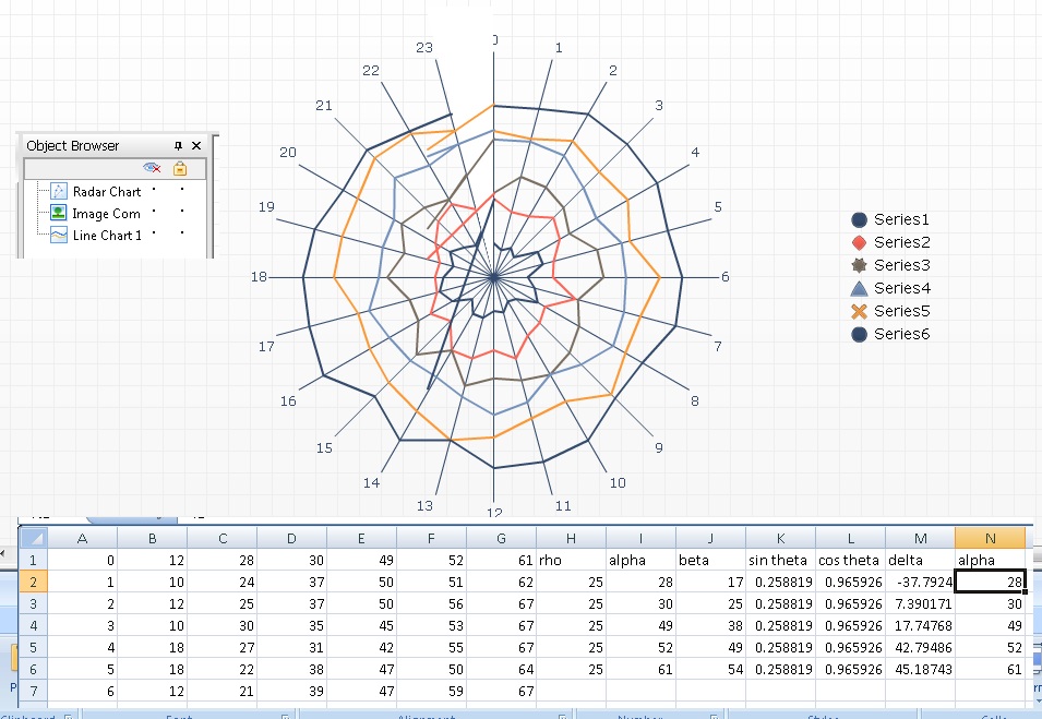

 (BOB member since 2002-06-20)