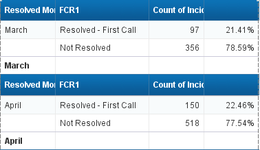
I have a data set (attached)
The client wants to see the percentages of the incidents that were “Resolved - First Call”, month over month in a line chart. The problem I am having is twofold:
1 - I can’t find a way to only graph one set of values (i.e. I want to see “Resolved - First Call” but not “Not Resolved” in the graph.
2 - If I set a filter on “Resolved - First Call” only, it skews all the percentages (they all go to 100%) - I need both values in the table to drive the percentage.
This wouldn’t be an issue if they cared about the counts, but they don’t - they want to see the percentages. Any ideas on how to do this?

kw1010 (BOB member since 2014-09-04)