I’d like to be able to display them in a bar chart format… but with the Postive in one bar…
and the Negatives in a 2nd bar broken out like a stacked bar chart. next to it. So the two negative amounts add up to one bigger negative value visually.
I’m going to have a few different timeslices next to each other (like MTD, YTD etc…)
I don’t see any built in charts that allow this… it appears it’s either one or the other…
Has anyone seen a control that allows this sort of combination, or can you recommend perhaps another visual element that might suit this purpose?
Nothing out of the box, you could use two of them one over the other and achieve this, right ? (will take a little bit of extra work :
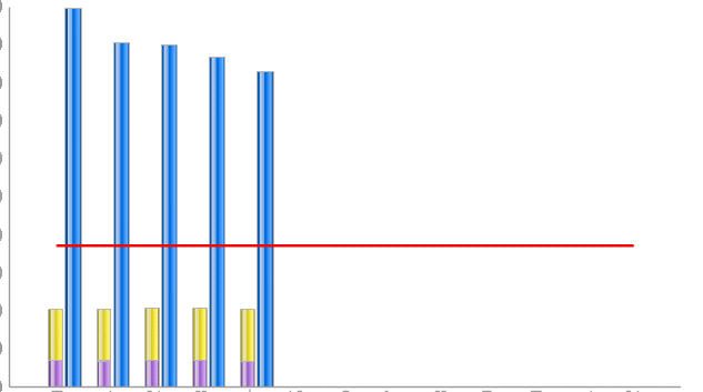
you looking for something like the attached screen shot ? it is a combination of bar + stacked chart…
(They are not exactly one over the other from a horizontal standpoint as that would hide the one behind…)
Yes I can use two over top each other… in fact I spent a good portion of yesterday afternoon mocking one up…
It looks great, however it was VERY difficult to line things up properly… I really wish Xcelsius had some of the height/width/position settings that you find in WEBI.
The only potential issue I can see at the moment is with the axis scale. I have to be careful to use an excel formula to normalize the scales to make sure both bars represent the correct height.
I have an example for a stacked combination chart at
The chart is different from the one you are trying to do but i have tried to include notes as to all the minor tweaks to be done.
As for the chart that you are trying to achieve (as in my screen shot below), I was able to handle the scales by using the cieling and max functions in excel.Something like the follows
Manual Y Axis
Max limit : formula used in excel =CEILING(MAX(T28:T30),1000)
Min limit : formula used in excel =CEILING(MIN(T28:T30),-1000) - I did not use this though as there was no negative values in our case.