Hi all,
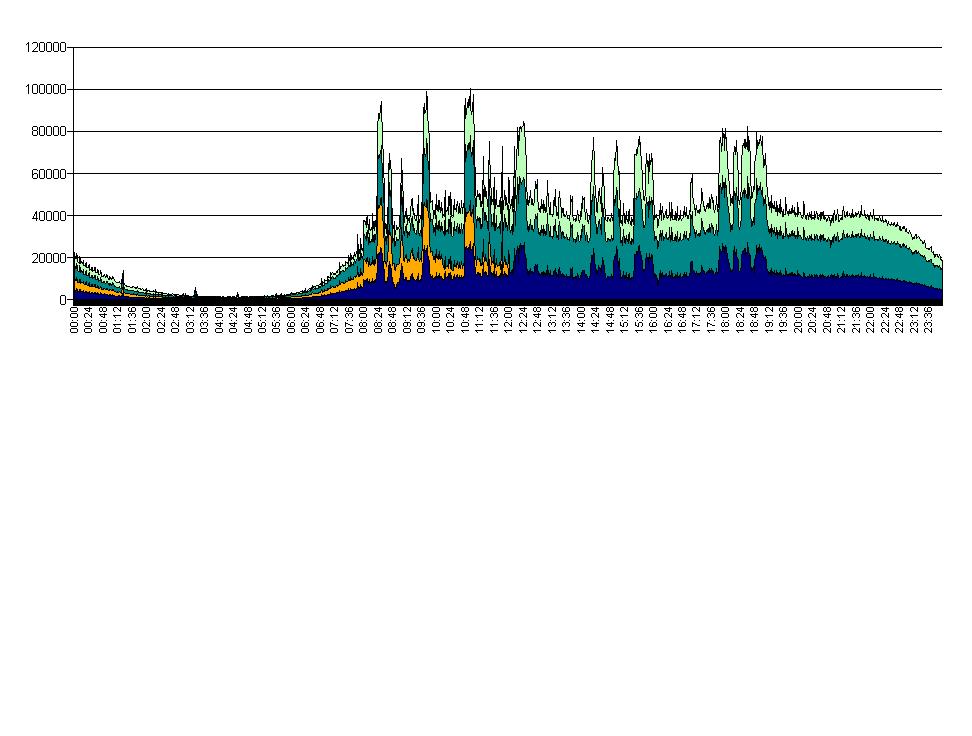
I have a char that shows in the X axis the timestamp (HH:MM) and in the Y axis the measure number of events (see the attached jpeg).
The problem is that the higher point of the graph (around 10:48 am) correspond to a value of 150000 number of events, instead the max value for the Y axis is 120000.
How can I “force” the graph to show the correct values in the Y axis? And of course also the graph should show the correct line at the corresponding higher point.
I played with all the options (adjust scale value to value range, modified the axis scale, and so on) but nothing works.
Even if I manually set a higher value to the Y axis using the axis scale format, it does not work, because the graph became shorter ![]() and it does not correspond the to real value.
and it does not correspond the to real value.
Thanks in advance,
Liz
lizard_queen2005 ![]() (BOB member since 2005-06-24)
(BOB member since 2005-06-24)
 (BOB member since 2010-06-11)