Hi,
I have a combined column line chart with 2 Y-Axis, I want to show the data values (measure1 and measure2) in different color, I did not find any option in ‘Format Chart’.
Can you please let me know if someone has already implemented this.
Have you tried right clicking the measure you want on the legend and then selecting format data series this should give you the chance to change colour
Or if you meant the text form, that may lay within the css
Thank you
I can see the format data series option, however there is no option available to change the color of ‘Data Values’ in that dialogue box. We can only the change the position of the data values in the Chart… please find the attached pic for ref…
This is such a small requirement, I wonder how did SAP missed this feature…
Thanks.
 (BOB member since 2003-11-27)
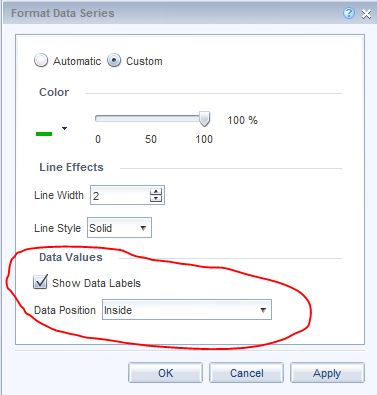
 (BOB member since 2002-08-20)