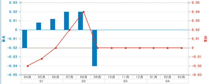
How can I adjust column & line chart satrt from the same point of x axis.
Ps: Red axis & Blue axis are not on the same level.
Hi Qli,
You’ll have to make the max value (fixed) on Y axis consistent (on Value Axis 1 and Value Axis 2), you can do that by updating Format Chart → Value Axis 1 → specify a value or variable (that calculates max value) from the dataset. You’ll have to do the same for Value Axis 2.
Checkout the slide 44 in this pdf, the formula they created is what I meant by Calculate the Max value.
Thanks,
Mohammed
1 Like
Thanks a lot !! Very helpful!!