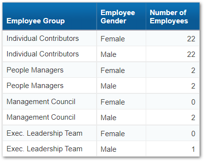
I have some basic HR data that I want to display in a crosstab. Here is what my data looks like.
If you want to take a crack at this here is some SQL (SQL Server syntax) you can put in a free-hand SQL query.
SELECT
‘Individual Contributors’ AS [Employee Group]
, ‘Female’ AS [Employee Gender]
, 22 AS [Number of Employees]
UNION SELECT ‘Individual Contributors’, ‘Male’, 22
UNION SELECT ‘People Managers’, ‘Female’, 2
UNION SELECT ‘People Managers’, ‘Male’, 2
UNION SELECT ‘Management Council’, ‘Female’, 0
UNION SELECT ‘Management Council’, ‘Male’, 2
UNION SELECT ‘Exec. Leadership Team’, ‘Female’, 0
UNION SELECT ‘Exec. Leadership Team’, ‘Male’, 1
What I want is to display not just the Number of Employees, but also the percentage of employees within Employee Group and Employee Gender as well as the Total. Here is what I came up with initially.
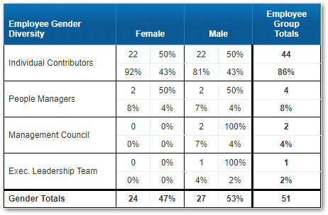
So we have four data elements for each intersection of Employee Group and Employee Gender.
- Upper-left = Number of Employees
- Upper-right = Number of Employees / Total Number of Employees within Employee Group
- Lower-left = Number of Employees / Total Number of Employees within Employee Gender
- Lower-right = Number of Employees / Total Number of Employees
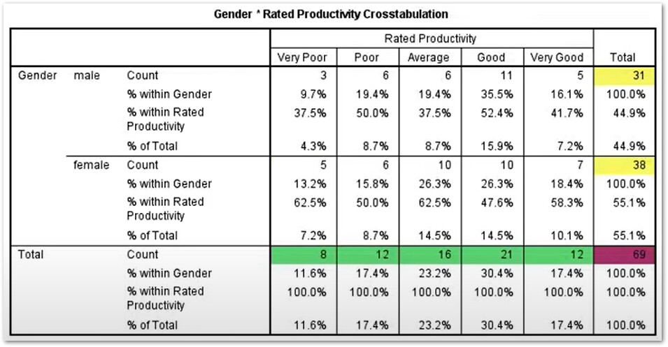
I did some Googling to see if I could find a better way to present this data. I came across this YouTube video on Interpreting percentages from a cross tabulation table in SPSS. SPSS looks to be a IBM tool which does not really matter, but I thought the results were an interesting alternative…
So I built a similar table with my data…
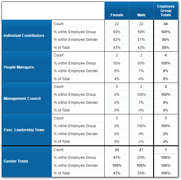
I like the first option because it is so concise, but it does not have the benefit of the explanatory labels the second option does.
I would like your input on what you prefer and why and/or any recommended adjustments. Or perhaps you have a completely different approach that would be even better. Please share.
Thanks,
Noel


