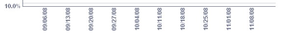
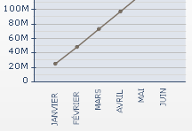
Sorry for the long title…I have a line chart that shows dates on the horizontal axis. If the dates orientation is horizontal, the font shows very clear and sharp(see img2). If the dataset is larger then the dates orientation changes to vertical…which is fine but then they show very fuzzy and distorted(see img3). I know it’s not that big of a difference but it is noticeable and an eyesore. I’m using device fonts right now; I’ve changed it to embedded fonts only for it to become more distorted. Just wondering if anybody has come across the same thing or has any ideas to make this behavior go away.
CX2008 sp1 fp1
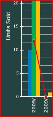
I’ve got a similar problem. The axis labels and titles are fuzzy when displayed vertically. Also, part of the x axis label and y axis title is being cut off and I can’t stop it happening (the x axis in the attached should be showing 2009/1, 2009/2, etc).
This may have more to do with Flex and Flash than Xcelsius. I’ve experienced some wonkiness in how fonts are rendered relative to how they look during design when embedding fonts, which is a major challenge and workflow impediment on our end.
What does it look like if you don’t choose embed fonts (based on the anti aliasing I’m assuming its turned on).
I’m really hoping Xcelsius gets recomplied leveraging Flash 10 which should bring font rendering improvements.
Do you mean under File>Document Properties?
If you do, the ‘Use Global Font’ option which contains the embed option is off by default on my system. I’ve tried turning it on and selecting a device font(instead of embedded) but this makes no difference.
BUT…I’ve now turned on the ‘use embedded fonts’ option and it has actually fixed the problem.
Cheers for pointing me in the right direction andyafco.
 (BOB member since 2007-01-10)