Something I haven’t encountered before - custom sort doesnt seem to work:
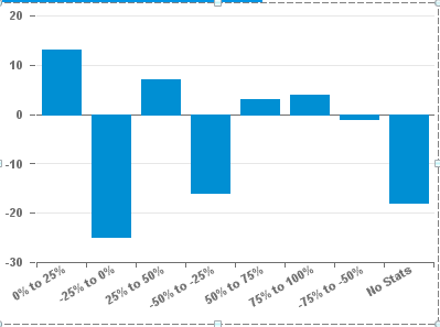
Image (Chart) is attached showing my chart, what I am trying to sort by is the category axis. It looks like by default it’s sorting this value ascending.
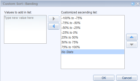
Image (sort) is the custom sort I have assigned, but nothing seems to happen when I apply it?
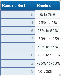
I attempted to make a variable if statement to assign to the chart, which I planned to hide however it has to be a measure and I can’t assign a measure at the category axis:
=If([Banding]="-100% to -75%";1;
If([Banding]="-75% to -50%";2;
If([Banding]="-50% to -25%";3;
If([Banding]="-25% to 0%";4;
If([Banding]="0% to 25%";5;
If([Banding]="25% to 50%";6;
If([Banding]="50% to 75%";7;
If([Banding]="75% to 100%";8;
If([Banding]="No Stats";9
)))))))))
Image of this measure attached (banding sort).
Does anyone have any clever ideas here - i’ve not encountered this before with custom sorts…
Hey, I am surely no expert, but if I wanted something to sort in aparticular way and NOT have to use the custom sort feature, I would add the sort number to the text of the bands.
“01: -100% to -75%”
“02: -75% to -50%”
Otherwise I would make a variable that said if Banding match “-100*” then 01, etc and sort by the banding sort field separately
I don’t see any images in your post, so if I am misinterpreting what you desired, I am not getting it.
Personally, I would just sort the bandings as they are effectively a sort of hardcoding, in any case.
Sometimes you have to apply your custom sort the dimension using a temporary isolated tabular column to get it to apply.
When a custom sort is applied it affects all instances where the object / variable is used in the output.
You could also be facing Java issues, have you tried to apply it via the HTML panel?
pattinyc: thanks for that it seemed to work, but obviously the prefix isn’t ideal - because the chart at times wont have people in that certian band I get the effect of say: 01: band one 04: band 4 displayecd in my cat axis.
Mak1: I will give that a shot.
Thanks!!
Thomas
EDIT:
Hi Mak1:
I tried sorting the values in the dimension, didn’t seem to help at all, neither did the isolated sort.
My variables used to build this chart as as follows:
If you look closely at some of those count(*) operations some are *-1 and some are not - I am trying to display those with a sub zero performance as a negative on the chart and those with a greater than zero as positive - per the second image I posted
 (BOB member since 2013-10-17)
 (BOB member since 2004-06-22)
 (BOB member since 2008-09-09)
 (BOB member since 2005-01-06)