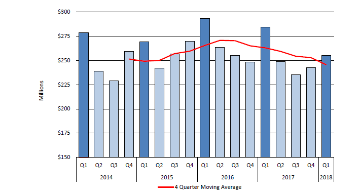
I’m trying to create a graph that has 2 groupings for the X-axis. One for year and the other for quarter.
I can create a formula that combines the two, however, this is not what the users wants to see. Please see the attached graph and look at the X axis. I want to be able to have quarter and year separated.
AFAIK, there is no way to do this in Crystal itself. The charting engine in Crystal is over 10 years old and fairly limited in what it will do. Unfortunately, SAP has no plans to update it in “classic” Crystal. If you happen to have Crystal Reports Server or BusinessObjects, they might be updating it in Crystal for Enterprise, but that won’t work outside of the server software.
Having said that… I just thought of something. If you write a command that groups the way you want to display it so that Crystal doesn’t have to do any processing on it, you might be able to do this. I’m not sure how you would get the different colors, though.
I have also done this type of complex visualization in Xcelsius (Crystal Dashboards) and embedded it in Crystal. However, Xcelsius uses Flash, which is old technology that has an EOL of 12/31/2020.
 (BOB member since 2007-04-16)