I have a report that uses a formula in each column to calaculate how many days between 2 dates. I use an “IF” formula to determine if the result is a 1 or a 0.
Eg: = If <=0 Then 1 Else 0
I have then created a variable that SUMs this result.
Eg: =Sum()
I want Desktop Intelligence to create a chart with the SUMs of these columns when the report runs, however, I cannot seem to get the SUMs to stand alone from the report in a seperate table which I can then convert to a chart.
Without changing your existing table, create a new variable that identifies each of the column headings. You can do this two ways:
Version 1: Use your existing formulae:
= If <=0 Then “Customer Requested Beat” Else If =1 Then “Customer Requested 1 Day Late” Else If =2 Then “Customer Requested 2 Days Late”… etc. etc.
Version 2: Use the existing variable:
= If =1 Then “Customer Requested Beat” Else If <Customer Requested 1 Day Late>=1 Then “Customer Requested 1 Day Late” Else If <Customer Requested 2 Days Late>=1 Then “Customer Requested 2 Days Late”… etc. etc.
Once you have the above, you then just need to create another variable which uses a unique ID for each row i.e. Customer_ID:
=Count(<Customer_ID>)
You should then be able to use these two variables for your chart…
Thank you APB for your quick support of this request.
I have successful completed the first part of creating a new variable using the formula you suggested, but I have got stuck again on the second part (=Count(<Customer_ID>).
Would you mind expanding your explanation a little further for me?
I apologise for not fully understanding your answer, and very much apreciate your help.
I assumed (rightly or wrongly) that you will have more than one customer that has the same expected and actual deliever date, therefore you have a unique id/name/reference no. for each customer that comes through on the data provider. Use this as your count variable.
Let me know if you need any further clarification.
The report is a single customer report. What I need to count in a seperate report (so I can graph it as a pie graph using percentages) is the total number of “Customer Request Met”, " Customer Request 1 Day Late"… Etc.
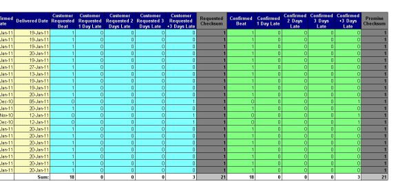
I succesfully (following your suggestion) have a column that tells me how each line performed. I now want to count the number of “Customer Request Met” and “Customer Request 1 Day Late” etc, so I can graph these.
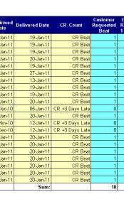
The attached file show the column I created from your advise.
If you don’t have any unique ID for the rows, then just do a count on the ‘Expected Date’, as long as you are aware that if there are two orders on the same date then this may not calculate correctly.
Instead of using the the existing tab, add a new tab and place only the two objects ‘CR Count’ and the above one into the report. You should only have two columns.
You can then use these to create your chart. When the chart is ready, just cut the whole thing and paste it into your original tab. The chart will be affected by any sections/breaks etc.
I have managed to create a unique ID for each row (I used the concatenation function to link 2 columns) and this works to count the total number of rows, however I am still unable to get a count of the different results (see attached).
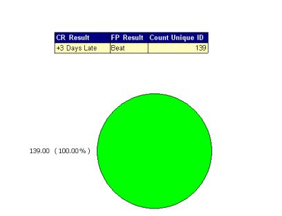
Change the Qualification of the ‘CR Result’ object to ‘Dimension’ from ‘Measure’;
Delete any existing chart, as this will likely show a blank chart;
Copy the table and paste again into the same tab, delete the middle column ‘FP Result’;
Change the table to a chart… done, I hope… format the chart as you see fit.
You can obviously add different types of charts, I’m not a fan of pie-charts as you need info to explain it, whilst a column or row chart are easy and clear to understand… especially for end users.
 (BOB member since 2006-12-04)