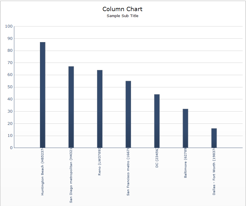
I have experienced UI problems with the Column Chart X Axis Labels for a long time. If the labels are of good length in number of characters, Dashboards tries to auto format the vertical position of the labels based on length in relation to all x axis column labels. This causes on some labels the last one or two chars to become hidden under the chart x axis. All text and formatting is default and using default theme. Only occurs on exportable swf… but looks great during preview with all text aligned with the x axis line. It’s not like a centering, but more like the uneven spacing during a combo left right justify in Word.
As long as the labels are not dynamic, my only work around has been to add “ -” (" -") to the end of some labels to adjust them to be somewhat close - never correct though - but at least they are not clipped and hidden under the chart area.
I don’t see any way to adjust or keep this from happening… any ideas? It makes the component almost unusable. It really discredits the designer because it makes it look like there are extra spaces embedded in the label data causing the erratic position.
Update:
I played around with it till I determined it is mostly affected by font size. It got really radical when I set the size to ten. Attached is a snapshot of SWF @ font size 10 pt. Here is the chart data:
Huntington Beach (HB52374) 87
San Diego metropolitan (H43215) 67
Reno (LW37892) 64
San Francisco metro (16678) 55
DC (23456) 44
Baltimore (62789) 32
Dallas - Fort Worth (198376) 16

datawizard (BOB member since 2015-01-20)
 (BOB member since 2005-01-28)