We recently upgraded our WebI reports from 3.1 to 4.0 and upon upgrade, we noticed that colors in bar chart have changed. In 3.1, we had different colors for each metrics, but in 4.0 everything is same.
Please suggest how to apply different colors to each of the bar’s in the chart? Should I change the config.file as mentioned below
Open C:\Program Files (x86)\SAP BusinessObjects\SAP BusinessObjects Enterprise XI 4.0\images\VisualizationConfig.template.xml
Save the file as VisualizationConfig.xml
Edit the colours as you please.
Save the file.
Restart Tomcat.
I think 4.1 may deliver a bit more flexibility around graph palettes. I would check, though, that the ‘type’ of the graph is the same as it was in 3.1. It may look the same as 3.1 did, apart from the colours, but make sure it is the sort of graph which, were it in 3.1 would use multiple colours. I hope that makes sense.
Sorry about that. It’s a typo error. It’s 4.0.5. This is one of the hot requirement that I have from customer, and wondering how I can implement this.
And to highlight, I have a 100% Stacked bar chart in which conditional formatting was applied in 3.1 (I see Red and Green in there), and this is working fine without any issues in 4.0.5. If I edit the color palettle, I’m not able to bring back to Red, and Green (I’m not going to edit and change the color but mentioning here to say that this cahrt is working when migrating from 3.1 to 4.0).
I was able to bring diff. colors to each of the bar but not custom coloring as it is in 3.1.
This particular chart only has measure values and no dimension objects in it. So when generating chart like this, we get same colors for all the bars. However, I made an workaround Yesterday to get different colors for each bar.
We are having a similar experience. We have migrated from 3.1 sp 5 to 4.0 sp 6. In many cases, our charts are as you described - they had several colors in 3.1, but only 1 color in 4.0. Also, we are often missing the legend. In some reports, the entire chart is gone and we cannot determine why this is.
Say I have a chart with 2 measures without having any dimension in the chart. When this generated in 4.0 using bar chart, both bars shall be displayed in the same color.
Yo might have selected two meausres in value axis, and "all measure names’ in category axis ('All measure names would be available when you generate the chart).
To show the different color, i did created couple of variables to have the measure names. Ex:
Var 1: NameOf([Measure 1])
Var 2: NameOf([Measure 2])
I applied these two variables in category axis by removing the ‘All measure names’ and thus bring the diff.color for each graph. But what is not possible here is that custom color palette which exist in 3.1.
Hope this helps and let me know if you have any questions please
Hi,
Have you tried KoolChart’s charting tools which provide different type of tools like pie chart, bar chart and many more. It gives you the flexibility to work in 3D with support of HTML5. I am sure it will help you out.
If anyone were to recommend to me to use a charting tool because it provides pie charts and 3D effects, I would recommend that they read the teachings of Stephen Few and Edward Tufte!
Selva, you can change the color of bars when you have multiple measures in column chart.
Just select the bar in your graph and go to Formatting -> background color and select the color you want and repeat the same steps for other bars (measures).
 (BOB member since 2002-08-15)
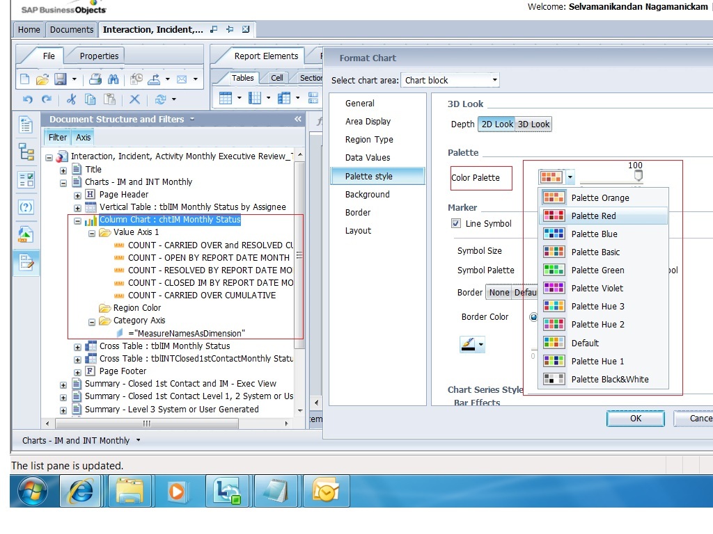
 (BOB member since 2008-10-15)
 (BOB member since 2005-08-17)
 (BOB member since 2006-03-30)