I am using WebI 4.1 and I have recently started using bar graphs.
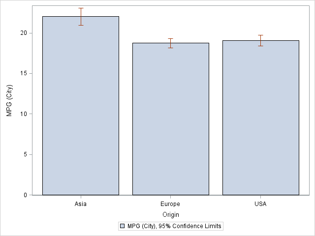
I am looking for some advice on how to create a bar graph which would also display the error bars (95% Confidence intervals for the plotted means). I can calculate the 95% CIs for the mean with BO, but I am not sure how to put them on the same graph as the plotted mean.
In BO, I have plotted the mean (measure: “calculated_Means”) as Y axis, groups (dimension) as X axis on the bar graph and I have another two measures “lower95%_CI_Mean” and “upper95%_CI_Mean” that I would also like to plot on the same graph but with the caveat that these two measures are displayed as error bar.
Hi, what kind of visualization are you using for these currently? Not sure what’s the version of BO that you have in your environment but box plot does look like a good fit for the visualization that you looking at …
 (BOB member since 2014-12-29)