I recently got Xcelcius 2008 and purchased two books with it. With that said, I obviously have a long way to go to become an expert with the software. Anyways, I have a column chart and the x axis labels are pretty long (ex. forecast at 90 days). At the moment, theses are vertical and I cannot seem to get this to change. I have gone into properties-appearance-x axis labels, but the position and offsets are greyed out. Can anyone tell me how to change this because right now this graph looks terrible. Thank you.
Xcelsius is a dashboard tool; so think of it this way; Does a car dashboard showing speed limits of 200mph show every single number on it’s Gauge or in sumary of 5 or 10? Hence think about that; you’ll get hang of the tool but will always have issues if you cannot ask the right questions of the tool.
p.s. Have a look at samples under file > samples> userguide samples
Thank you. I guess I probably didn’t do a good job of explaining exactly what my issue is. If I have several columns in a column chart and there is a label under each column, specifying exactly what the information is, how do I change that label to be horizontal instead of turned 90 degrees? Hopefully that makes more sense. Thanks!
There is a little trick you can use to wrap the X-axis labels.
Select an appropriate gap in your long text say after the ‘at’ in ‘forecast at 90 days’, and hold Alt and hit Enter. The text will then wrap in your X-axis from
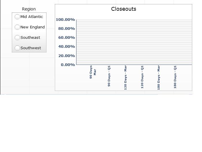
Thank you. That is deifnitely good to know. Is there anyway for me to rotate the text 90 degrees? I have attached a screenshot below so you can see how it is now. Thank you so much.
 (BOB member since 2005-01-28)